

What Is Databox?
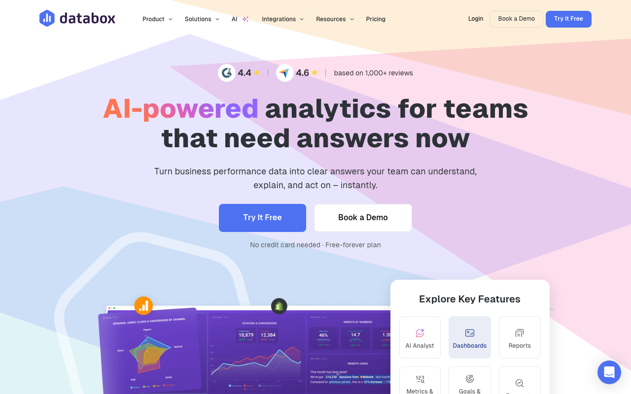
Databox is the analytics dashboard platform that consolidates data from 100+ sources into unified business dashboards. Founded in 2014, Databox serves over 20,000 companies, mostly marketing agencies and SMB marketing teams who need to combine metrics from HubSpot, Google Analytics, Facebook Ads, Salesforce, and dozens of other tools into single views.
The pitch is consolidation. Marketing data lives in 12+ tools by the time you count ad platforms, analytics, CRMs, email tools, and customer success software. Building unified reports manually requires a data analyst and weeks of work. Databox provides pre-built connectors and template dashboards that consolidate everything in hours, not weeks.
The product targets marketing agencies reporting to clients monthly and SMB marketing teams who need executive dashboards. Enterprise teams often use Tableau or Looker for similar consolidation at higher cost and complexity.
Try Databox Free Get started →How Databox Works
Connect data sources via OAuth or API keys. The library covers 100+ sources: Google Analytics 4, Google Ads, Facebook Ads, HubSpot, Salesforce, Stripe, Shopify, Mailchimp, Slack, Pipedrive, and dozens more. Each connection pulls historical data and ongoing updates.
Build dashboards from drag-and-drop tiles. Each tile shows a metric (sessions, revenue, leads, MRR) with visualization options (line chart, bar chart, big number, table). Pre-built tile templates speed up creation; custom calculations support derived metrics.
Goal tracking and alerting layer onto dashboards. Set targets per metric (sessions goal, MRR goal); progress visualizations show how you are tracking. Alerts notify when metrics cross thresholds.
Scoreboards rank performance across team members, locations, or campaigns. Agencies use scoreboards to track multiple clients; sales teams use them for rep performance.
Sharing options include public dashboards, password-protected client links, scheduled email reports, and Slack/Teams updates. Agencies share branded dashboards with clients; in-house teams share with executives.
Databox Pricing in 2026
Free: 3 dashboards, 3 data sources, weekly refresh. Trial-grade.
Starter: $59/month annually. Unlimited dashboards, hourly refresh, 5 data sources.
Professional: $169/month annually. 35 data sources, custom branding, white-label.
Premium: $399/month annually. 60 data sources, advanced security, dedicated CSM.
Performer: Custom pricing. Unlimited everything for high-volume usage.
See Databox Plans See plans →Where Databox Wins
- Pre-built integrations: 100+ sources often easier than building in Looker Studio.
- Mobile dashboards: stronger mobile experience than most competitors.
- Goals and alerts: built-in performance management beyond pure reporting.
- Agency-friendly: white-label and client management features.
- Template library: ready dashboards for common use cases (SEO, paid ads, ecommerce).
Where It Falls Short
- Limited custom calculations: complex derived metrics need raw data exports.
- Pricing scales with sources: lots of integrations means higher tier.
- Data refresh delays on lower tiers: real-time on top tier only.
- Less customization than Tableau: pre-built tile model has limits.
Databox vs Looker Studio vs Klipfolio vs AgencyAnalytics
Looker Studio (Google) is free and flexible. Requires more setup, no native integrations beyond Google products.
Klipfolio is similar scope with weaker UX.
AgencyAnalytics targets marketing agencies with stronger client-reporting features.
Tableau and Power BI are enterprise BI tools with more depth but higher complexity.
Who Should Use Databox
Marketing teams consolidating multi-tool data: pre-built blocks save time.
Agencies reporting to clients: white-label and automated reporting fit.
SMBs needing executive dashboards: from scattered tools to unified views.
Skip it if: you live primarily in Google Analytics + Sheets (Looker Studio is free), you need a real data warehouse (use Metabase or Looker), or you only have 1-2 data sources to track.
How Databox works
Databox is a no-code business intelligence and dashboard platform that pulls metrics from marketing, sales, finance and product tools into shared dashboards, automated reports, goals and forecasts. It targets teams that want KPI visibility without a data team or a warehouse project. The current pitch centers on Genie, an AI analyst you ask performance questions in plain language, alongside the classic dashboard and client-reporting workflow that agencies use it for.
You connect sources through OAuth. There are 130+ native integrations including HubSpot Marketing and CRM, Google Ads, GA4, Facebook Ads, LinkedIn Ads, Shopify, Stripe, QuickBooks, Salesforce, Pipedrive, Google Search Console and Mailchimp. Databases and warehouses connect through a no-code connector (BigQuery, MySQL, PostgreSQL, Snowflake, Azure, Google Cloud, Redshift, Oracle), spreadsheets through Google Sheets and Excel, and automation platforms through Zapier, Make and Dataddo. Anything not covered can be sent in through the Push API, and there is a REST API for custom integrations.
Once data is in, many integrations expose a Metric Builder for custom metrics with filters and segmentation. Datasets let you clean, merge and standardize raw data before building on it, and metrics built from a dataset support row-level drill-down. Dashboards are drag-and-drop, either from 300+ templates or from scratch, with custom colors, logo, background and white-labeling. Sharing works four ways: a live shareable link, scheduled PDF or JPG snapshots by email or Slack (recipients need no account), embeds into pages and tools like Notion and ClickUp, and Stream to TV for wall displays. There is also a mobile app, dashboard loops that cycle through grouped dashboards, annotations to explain spikes, per-dashboard permissions, and an MCP server for querying your data from AI tools like Claude.
Where Databox wins
- Connector coverage that is genuinely broad for a mid-market tool. 130+ SaaS sources plus warehouses and databases with no-code setup, and a Push API and REST API so nothing becomes a dead end.
- Client-reporting features agencies actually need. White-labeling, custom branding, scheduled PDF/JPG snapshots to people without accounts, embeds, and per-dashboard permissions including public links.
- Drill-down to the underlying rows. Datasets plus metric drill-down let you go from a dashboard tile down to the row-level data behind it, which most lightweight dashboard tools cannot do.
- Templates instead of a blank canvas. 300+ dashboard templates per source (Facebook Ads, GA4, HubSpot, Search Console, Shopify, QuickBooks) get a working dashboard up in one click.
- Unlimited users on Pro and above. Viewer count is not a cost lever the way it is with most BI tools, so adding stakeholders costs nothing.
Where it falls short
- The free plan is a demo, not a tier. 3 data sources, 1 dashboard, 1 user, daily sync only, 11 months of history and 10 custom metrics.
- Data-source pricing is the real trap. Analyst caps at 5 sources for a single user. The team plans (Pro $159/mo, Growth $399/mo, billed annually) include only 3 sources and charge $5.60/month for each extra one, so a 20-source agency stack adds roughly $95/month on top.
- Sync frequency is tiered. Daily on free, hourly on Analyst and Pro, and 15 minutes only on Growth at $399/month. Nothing is true real time, despite the dashboards being described that way.
- Datasets are partially held back. On Pro they are limited to spreadsheets and databases, with full datasets, forecasting and OKRs reserved for Growth. Historical data is capped at 24 months below Growth.
- AI is metered by credits. 50/month on free, 500 on Analyst, 1,500 on Pro, 4,000 on Growth, so heavy Genie use pushes you up a tier rather than costing a predictable amount.
- SSO, white-labeling and priority support sit on the Custom tier only, which means contacting sales.
Who should use Databox
Databox fits marketing agencies reporting to clients, and SaaS or SMB teams of roughly 5 to 200 people that want cross-tool KPI dashboards without hiring an analyst or standing up a warehouse. The combination of white-labeling, scheduled snapshots to non-users and unlimited viewers on Pro is what makes the agency case work, and the template library shortens the time from connection to a dashboard someone will actually look at.
Skip it if you need freshness below 15 minutes, since even the top published tier does not go faster. Skip it if your stack runs past about 15 sources and you are cost-sensitive, because the per-source charge compounds. And skip it if you already run dbt plus a warehouse and want SQL-native modeling, where a dedicated BI tool is the better fit.
Frequently Asked Questions
Can I share dashboards with clients?
Yes. White-label sharing on Professional plans.
How often does data refresh?
Varies by tier. Weekly on free, hourly on Starter, real-time approaches on Premium.
Does it support custom data sources?
Yes via API and custom integrations on Professional and above.
Can I export to PDF?
Yes. Scheduled PDF reports email automatically.
What about mobile?
Strong mobile app for iOS and Android. Dashboards optimized for mobile viewing.