.avif)

The finance department in any company is a place where anxiety, stress and other mental ailments reside. Analysts and spreadsheet wizards look tired, staring at the financial data on their screens for hours. It’s a stressful job to be a financial analyst or even a finance manager in a company. If you’re a solo founder or a freelancer, you can say goodbye to peaceful sleep. There is no way you can get a clean financial snapshot without hiring a full-time, anxious accountant. At least AI did something good by lowering stress for those looking at their company’s or personal finances.
In this tutorial, we'll show you how to use Claude to organise scattered business finance documents into a neat, efficient dashboard. We’ll show you how to upload business financial documents, prompt Claude to clean and optimize the data, review the dashboard and make changes, add columns, or compare the current data with last month’s metrics.
By the end of this tutorial, you’ll be able to;
- Start with Claude
- Upload business financial data and prompt Claude
- Review the dashboard and ask Claude to make changes
- Add more columns or compare the data with last month
Let’s get into it!
Step 1 - Start with Claude
As always, gather the documents you want to analyze and organize using Claude. Access Claude and sign in to an account (free or paid plan).
Yes, you can do this with a free plan; however, it might have fewer iterations. To connect your tools, such as Google Drive or Google Sheets, you must upgrade to a paid plan.
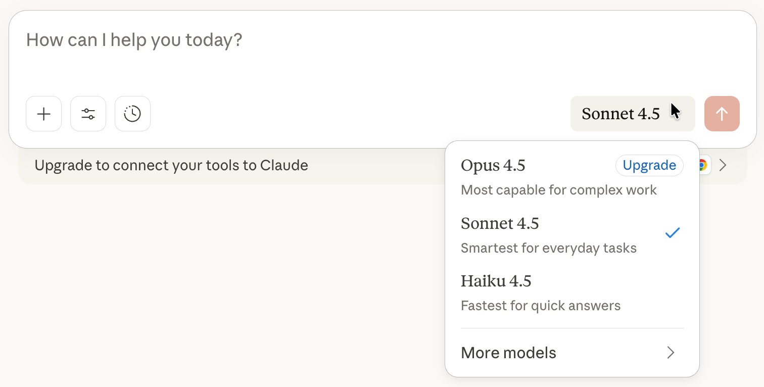
In the main chat interface, pick the default model for this task. The default is Sonnet 4.5. It’s powerful and efficient to organize your financial data.
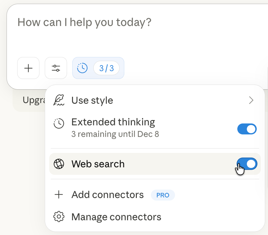
Next, open the model's settings. Click the settings icon in the chat interface and turn on extended thinking if it’s available in your account.
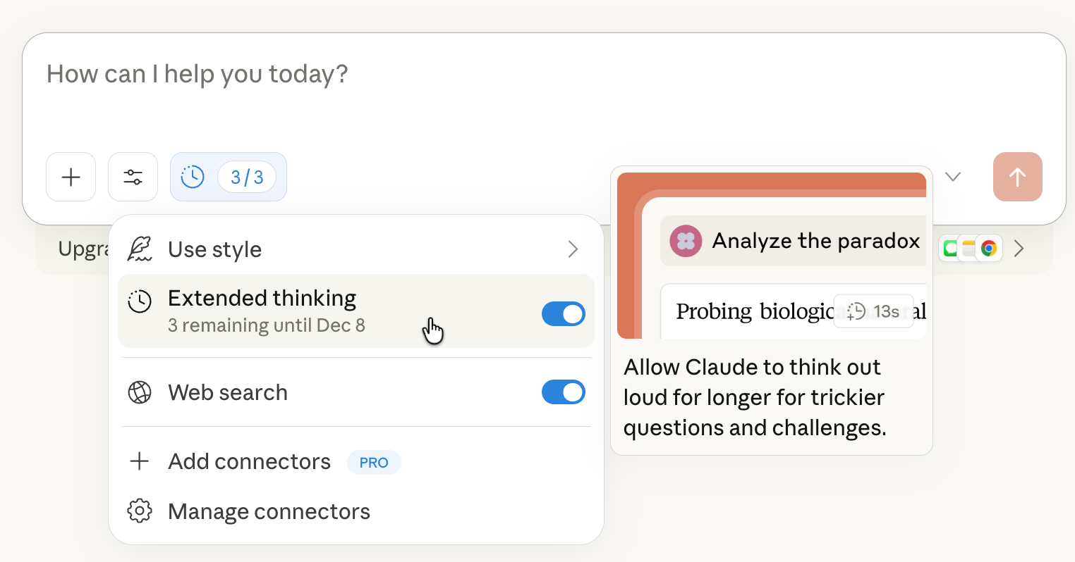
Enable web search if you want Claude to double-check any assumptions.
If you’re using this for real financial reporting, the free tier is fine for testing, but you should upgrade once it becomes part of your workflow, since the added tools and higher limits are genuinely worth it.
Step 2 - Upload business financial data and prompt Claude.
Start by uploading your financial documents, preferably in PDF or CSV format. This can include revenue summaries, invoices, expenses, and inventory details.
Now you’ll tell Claude what you want done with your messy financial files. In the chat box, write a prompt that covers:
- What you’re trying to accomplish
- What files are you uploading
- How do you want the data cleaned and organized
- How you want the dashboard to look and feel
Most dashboards end up looking like an old accountant tool from 2008. Being clear about the style isn’t fluff. It’s what makes the difference between something people actually want to look at and something they completely ignore.
Prompt:
I need help organizing my business finances this year. I'm going to be uploading my files. In particular, I'm uploading an invoice file, an expense file, my customers' payroll, as well as inventory files. Formatting is inconsistent because I've been adding it all year, so I need you to organize this. Can you create a cleaner version with a dashboard that shows my total income, breaks it down by month, lists my customers, and also adds data visualisations showing trends in my expenses? Just make it one big, beautiful dashboard we can look at that gives us an instant snapshot of the business finances. Lastly, make this a sophisticated financial dashboard with a quiet luxury aesthetic and use abundant white space. You may need to write a Python script to retrieve the spark lines and enable the advanced features.
Click the up-arrow icon and send your prompt to Claude.
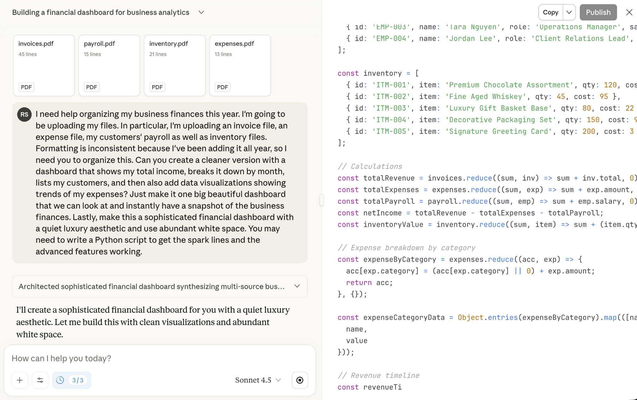
Here’s how the dashboard looks.

Step 3 - Review the dashboard and ask Claude to make changes.
Review your dashboard and figure out whether it’s the right one for you. You can always ask Claude to make changes to the dashboard. It can also turn your data into visuals that your stakeholders actually enjoy reviewing, including pie charts and bar graphs.
For example, add a card showing the revenue loss you are experiencing relative to an ideal case in the corporate gifting business.
Prompt:
Include a dashboard card showing the revenue loss relative to an ideal case for a corporate gift basket business.
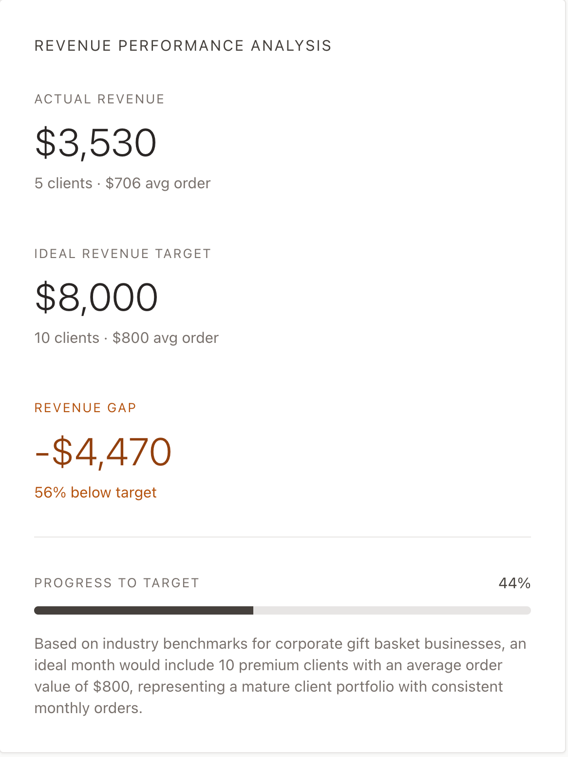
That’s perfect. It included a comparison based on industry benchmarks for corporate gift basket businesses. That’s an innovative data point that might help you achieve your business goals as a person looking to match industry benchmarks for earned revenue.
Step 4 - Add more columns or compare the data with last month
You can keep going by adding more columns or uploading last month’s data and instructing Claude to compare the revenue and other data points.
Let’s say you want to enrich the dashboard with natural language.
Prompt:
Can you add a column showing how many days it’s been since each invoice? I want to see which pending payments are getting old.
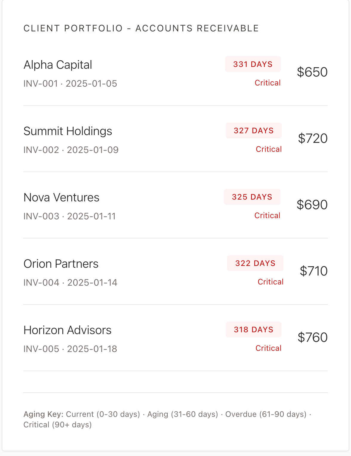
That’s fantastic. You have basically saved thousands of dollars that might have been spent on professional analysts to get this kind of data.
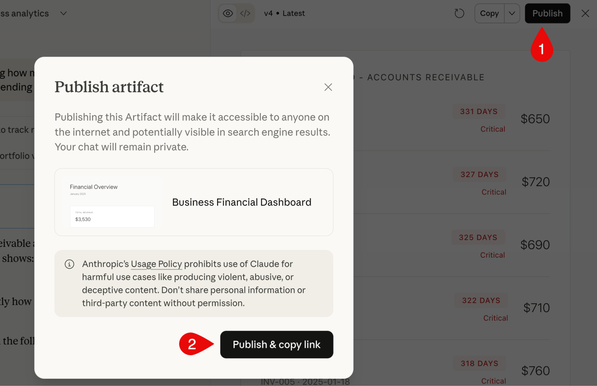
Once you’re satisfied with the results, you can publish and share your dashboard as an artefact. Click ‘Publish’ right above the results pane and click ‘Publish & copy link to publish your dashboard.
That’s it for this tutorial, financial gurus! This use case is a great fit for small teams without their own finance folks. It gives you and your stakeholders a clear view of what’s doing well, what’s draining cash, and what needs adjusting or dropping.
.png)
.png)