.avif)
.png)
Who amongst us likes tax policies? It’s a drag to review tax policies and make a decision. How about wading through an endless pile of documents, trying to visualize the data just to get confused. However, with the help of AI, you can now build a tax policy visualizer to help you and your customers find reliable information without reading an entire pile of endless boring PDFs.
Understanding tax policy shouldn't require a degree in economics. In this tutorial, you'll learn how to build an interactive tax policy visualizer using Manus—a tool designed to make complex fiscal concepts accessible to everyone, even high school students. We'll guide you through creating a modern, web-based app that lets users tweak key tax parameters and instantly see how those changes affect government revenue. With a clean two-column layout built in TailwindCSS and real-time data visualization powered by D3.js, this tool combines education and engagement in a sleek, intuitive interface. Whether you're curious about how tax cuts impact public budgets or want to decode political promises, this project will show you how to clarify tax policy through code.
By the end of this tutorial, you’ll be able to:
- Write a comprehensive prompt for the tax policy visualizer
- Provide key requirements and a goal
- Access the visualizer tool in Manus
- Export and download the files
Let’s get started!
Step 1 - Write a comprehensive prompt for the tax policy visualizer
The first and most important step in creating a tax policy visualizer tool is crafting a comprehensive prompt that provides context and details. This helps AI understand what it should do to create the tool.
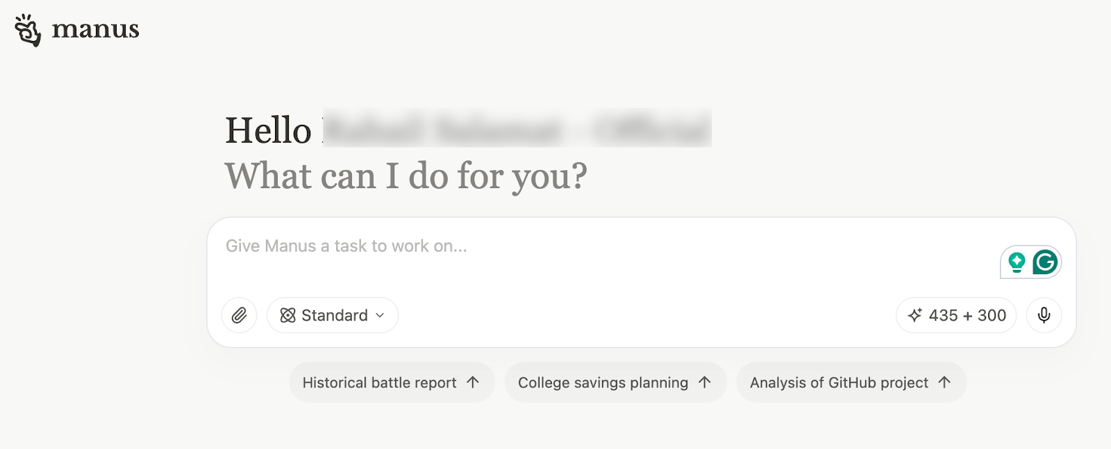
Start by accessing Manus. Go to the main chatbot interface.
To write the prompt for the tools, start by clearly stating the goal (e.g., writing an intro for an article). Then provide specific context: what the tool does, who it's for, and why it matters. Include technical details like required technologies (e.g, TailwindCSS, D3.js) and layout (e., two-column). Finally, describe the desired tone and user experience—fun, educational, and intuitive. Be concise but complete, so the AI assistant understands both the purpose and constraints.
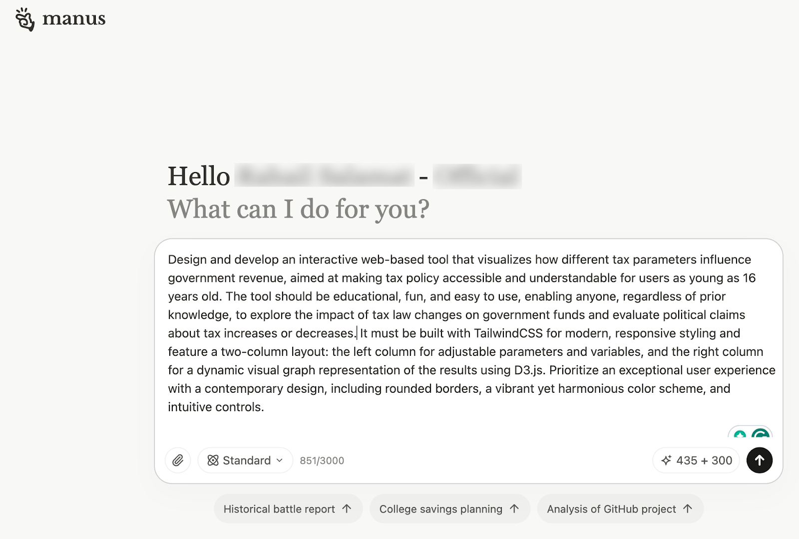
You can use the following prompt as inspiration or copy and modify it to create your own customer visualizer tool.
Prompt:
Design and develop an interactive web-based tool that visualizes how different tax parameters influence government revenue, aimed at making tax policy accessible and understandable for users as young as 16 years old. The tool should be educational, fun, and easy to use, enabling anyone—regardless of prior knowledge—to explore the impact of tax law changes on government funds and evaluate political claims about tax increases or decreases. It must be built with TailwindCSS for modern, responsive styling and feature a two-column layout: the left column for adjustable parameters and variables, and the right column for a dynamic visual graph representation of the results using D3.js. Prioritize an exceptional user experience with a contemporary design, including rounded borders, a vibrant yet harmonious color scheme, and intuitive controls.
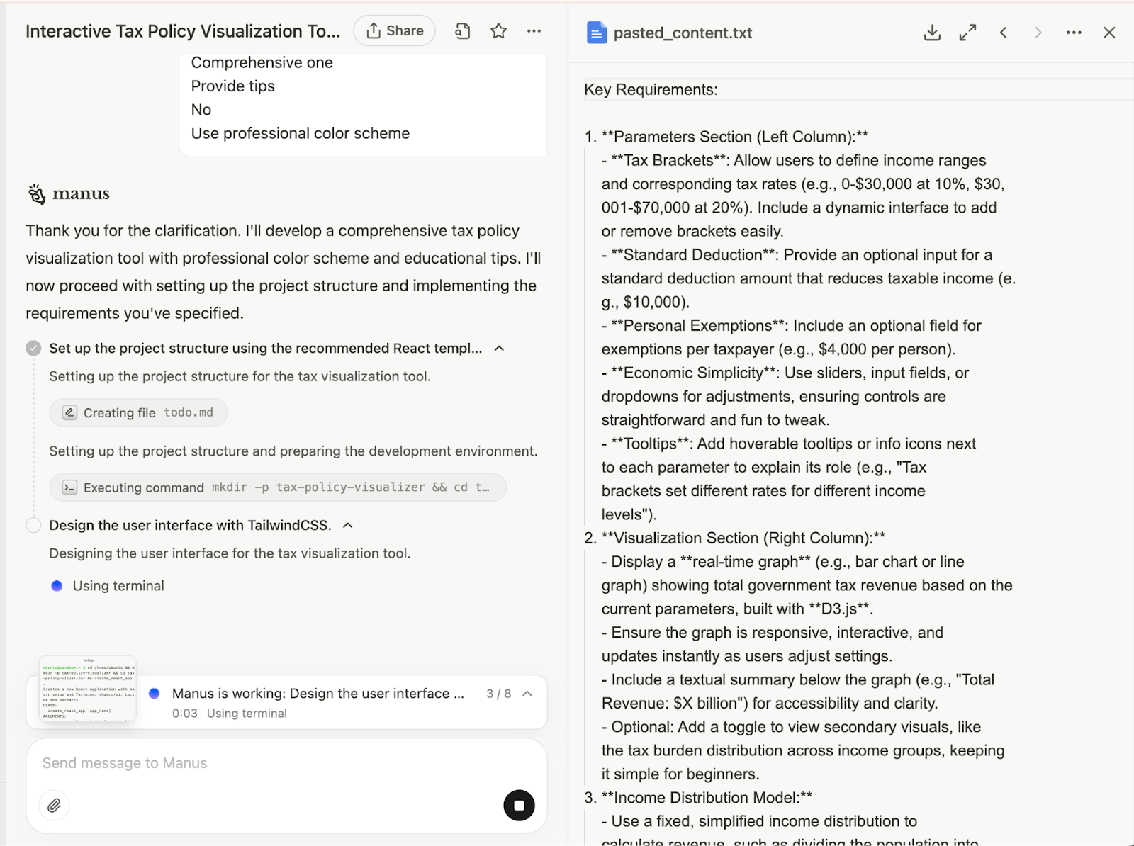
Step 2 - Provide key requirements and a goal
Next, you must provide detailed context by outlining the key requirements and goals. Describe each section of the tool and provide details like parameters, technical specifications, and accessibility and engagement. Focus on clearly defining what the output should achieve and the constraints it must follow.
Key Requirements:
1. **Parameters Section (Left Column):**
- **Tax Brackets**: Allow users to define income ranges and corresponding tax rates (e.g., 0-$30,000 at 10%, $30,001-$70,000 at 20%). Include a dynamic interface to add or remove brackets easily.
- **Standard Deduction**: Provide an optional input for a standard deduction amount that reduces taxable income (e.g., $10,000).
- **Personal Exemptions**: Include an optional field for exemptions per taxpayer (e.g., $4,000 per person).
- **Economic Simplicity**: Use sliders, input fields, or dropdowns for adjustments, ensuring controls are straightforward and fun to tweak.
- **Tooltips**: Add hoverable tooltips or info icons next to each parameter to explain its role (e.g., "Tax brackets set different rates for different income levels").
2. **Visualization Section (Right Column):**
- Display a **real-time graph** (e.g., bar chart or line graph) showing total government tax revenue based on the current parameters, built with **D3.js**.
- Ensure the graph is responsive, interactive, and updates instantly as users adjust settings.
- Include a textual summary below the graph (e.g., "Total Revenue: $X billion") for accessibility and clarity.
- Optional: Add a toggle to view secondary visuals, like the tax burden distribution across income groups, keeping it simple for beginners.
**Income Distribution Model:**
- Use a fixed, simplified income distribution to calculate revenue, such as dividing the population into 10 groups (deciles) with predefined average incomes (e.g., bottom 10% at $10,000, top 10% at $100,000).
- Base this on a hypothetical yet realistic distribution, or simplified real-world data, to keep it relatable.
- Optional: Include an 'Advanced Mode' where users can adjust the income distribution (e.g., scale average income or inequality), but keep the default mode simple.
4. **Tax Revenue Calculation:**
- For each income group, compute taxable income (after deductions/exemptions) and apply progressive tax rates based on the brackets.
- Sum the tax collected from all groups to determine total revenue.
- Example: For an income of $50,000 with a $10,000 deduction and brackets of 0-$30,000 at 10% and $30,001-$70,000 at 20%, tax = (30,000 - 10,000) × 10% + (50,000 - 30,000) × 20%.
5. **User Experience & Design:**
- **Styling**: Use **TailwindCSS** to create a modern look with rounded borders (e.g., rounded-lg), subtle shadows (e.g., shadow-md), and a bright, appealing color palette (e.g., blues, greens, and purples with neutral backgrounds).
- **Layout**: Implement a two-column design that stacks vertically on mobile devices using Tailwind’s responsive classes (e.g., md:flex).
- **Interactivity**: Ensure smooth animations (e.g., graph transitions) and immediate feedback when parameters change.
- **Ease of Use**: Include a 'Reset' button to revert to default settings and a short onboarding message (e.g., "Adjust the sliders to see how taxes affect revenue!").
- **Fun Element**: Add pre-set scenarios like "Current Tax System," "Flat Tax," or "Tax the Rich" that users can load with one click to compare outcomes
6. **Educational Features:**
- Provide simple explanations of results (e.g., "With these settings, revenue increased by 15% compared to the default").
- Include a separate tab or section to demonstrate the **Laffer Curve** (revenue vs. tax rate with a peak), using a single-rate slider for educational purposes
- Ensure all terms are beginner-friendly, with optional links to further resources (e.g., "What are tax brackets?").
7. **Comprehensive Parameters:**
- Cover key variables affecting tax revenue: tax rates, brackets, deductions, exemptions, and a fixed income base.
- Optional advanced features: economic factors (e.g., GDP growth), tax avoidance rates, or behavioral responses (e.g., higher rates reducing taxable income), introduced in an 'Advanced' section to maintain simplicity for core users.
8. **Technical Specifications:**
- **TailwindCSS**: Style components like cards (bg-white p-4 rounded-lg shadow), buttons (bg-blue-500 text-white rounded-md), and inputs for a polished UI.
- **D3.js**: Build a dynamic, scalable graph with axes labeled clearly (e.g., "Revenue" on y-axis, fixed scale on x-axis).
- **JavaScript**: Handle calculations and real-time updates, storing parameters in an object or array (e.g., { brackets: [{ range: [0, 30000], rate: 0.1 }] }).
- **Shareability**: Encode parameters in the URL (e.g., ?brackets=0-30000-10,30001-70000-20) so users can share or bookmark specific configurations.
9. **Accessibility & Engagement:**
- Ensure good contrast and readable fonts (e.g., font-sans text-lg).
- Add hover effects on interactive elements (e.g., hover:bg-blue-600) for engagement.
- Provide text alternatives for graph data to support screen readers.
Now, specify the end goal for the tool. The goal helps the AI assistant understand what is expected as the end result. Use the following:
Goal:
Create an engaging, educational tool that demystifies tax policy, showing how tweaks to tax laws affect government revenue in a tangible way. It should empower users to test political claims (e.g., "Raising taxes on the wealthy will boost revenue") by adjusting parameters and seeing the results, all within a fun, visually appealing, and easy-to-navigate interface."
After you’ve specified key requirements and the goal, the whole prompt will look like this: Click the up-arrow button to submit the prompt.

Manus will take time to build the tool.
Manus will ask your permission before deploying the tool to the public network. Click ‘Accept.’

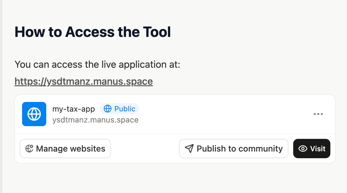
Step 3 - Access the visualizer tool in Manus
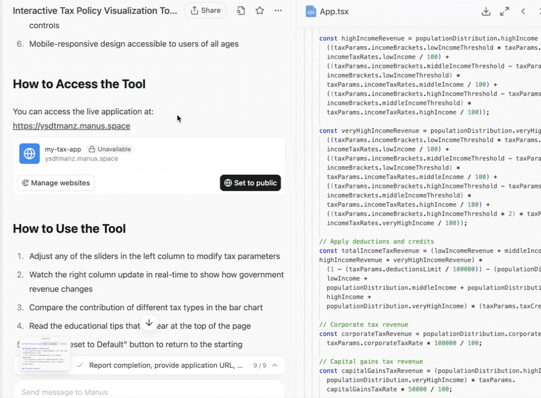
Once Manus finishes the task, you can access the tool by clicking the URL it generated in the chat.
This is how it looks.
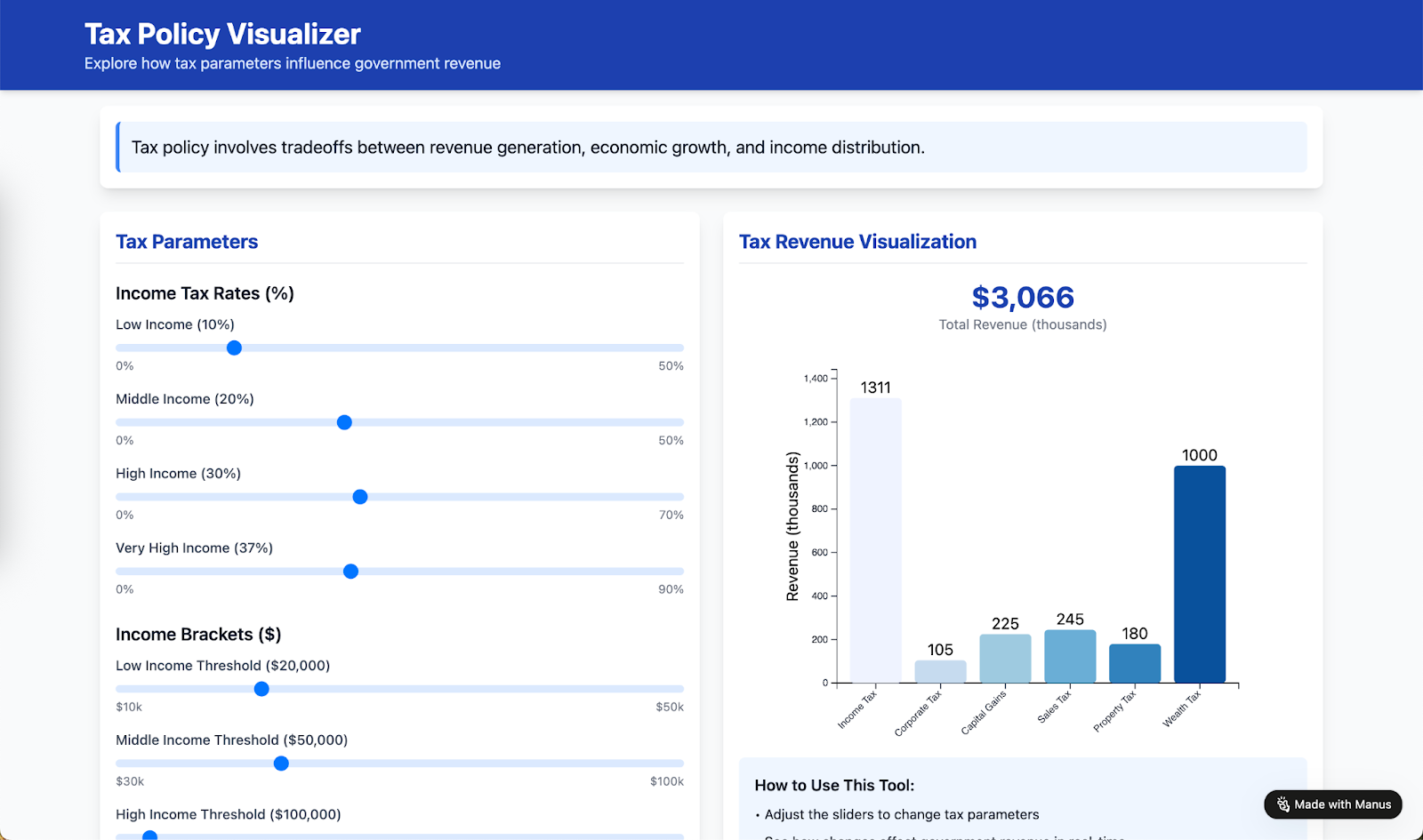
Manus created a simple slider system to change tax parameters, which is very easy to understand. It also provided tips on how to use the tool, which is quite impressive.
The app will remain on the public network until you make it private. Click ‘Manage website’ under ‘How to access the tool.’ It's in the chat window. You can make it private so only those with the URL can access it.
If you want to deploy the tool on your domain, copy the code and deploy it on your domain.
Step 4 - Export and download the files
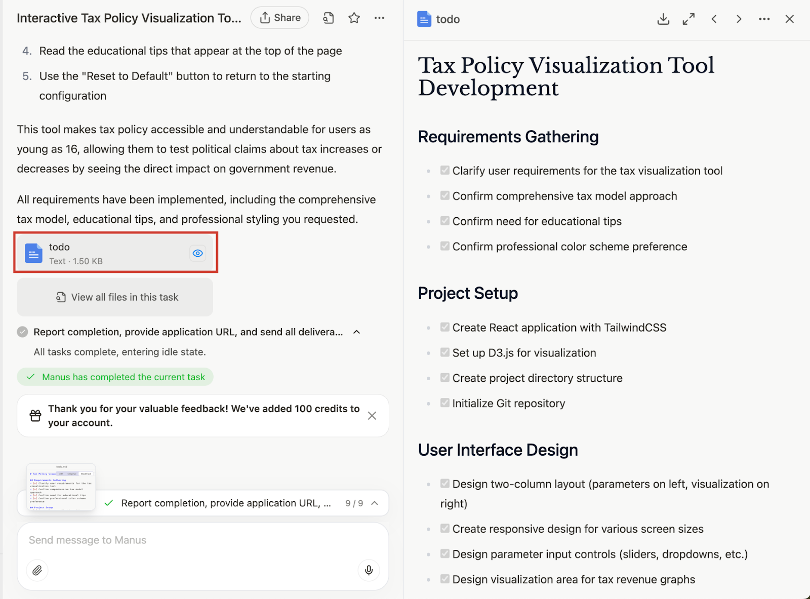
Click ‘View all files in this task’ and download each one to your computer. It contains all the code that Manus created to build and deploy the tax policy visualizer tool.

Click the ‘todo document’ to download the list of tasks Manus followed to develop the tool.
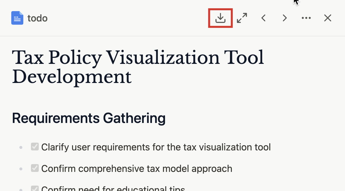
To download the list, click the download button at the top of the output panel.
That’s all for this tutorial, folks. Use follow-up prompts to refine the tool. Add features or functionalities that users might like. Experiment with prompts to make it unique. Remember to deploy the visualizer tool on your own domain. It can be a new way to attract clients.


.avif)
