.avif)
.png)
One thing AI is getting right is helping professionals tame messy data. Back when our desks were covered in papers, we lost files in drawers, under stacks, and sometimes in places no one likes to admit. Today, everything lives on our computers, yet the personality of data has not changed. It still gets messy. People still spend hours trying to clean it and make sense of it. AI finally breaks that cycle. It saves time, cuts the effort, and organizes information with the focus of a robot determined to tidy every corner of a chaotic house.
Google’s NotebookLM is one of those AI services that most of us have access to. And it is super efficient in keeping notes, doing some great stuff like organizing unstructured data in Excel files, and many other tasks. This tutorial focuses on teaching you how to turn complex topics and other forms of data into visually appealing infographics and slide decks. We’ll show how to access NotebookLM, upload your sources for analysis, review the output and suggest changes, and share your work with stakeholders.
By the end of this tutorial, you’ll be able to:
- Access NotebookLM
- Analyze and create infographics and slide decks
- Review and make changes to the output
- Share your work with stakeholders
Let’s dive right into it!
Step 1 - Access NotebookLM
Before firing up your browser to open NotebookLM, gather the data you want to analyze and clean. Let’s say you have a marketing campaign for Suitebaskets (A high-end gift basket business). Gather the A/B testing campaigns of two different marketing campaigns.
Open NotebookLM and sign in to your account, preferably a paid one.
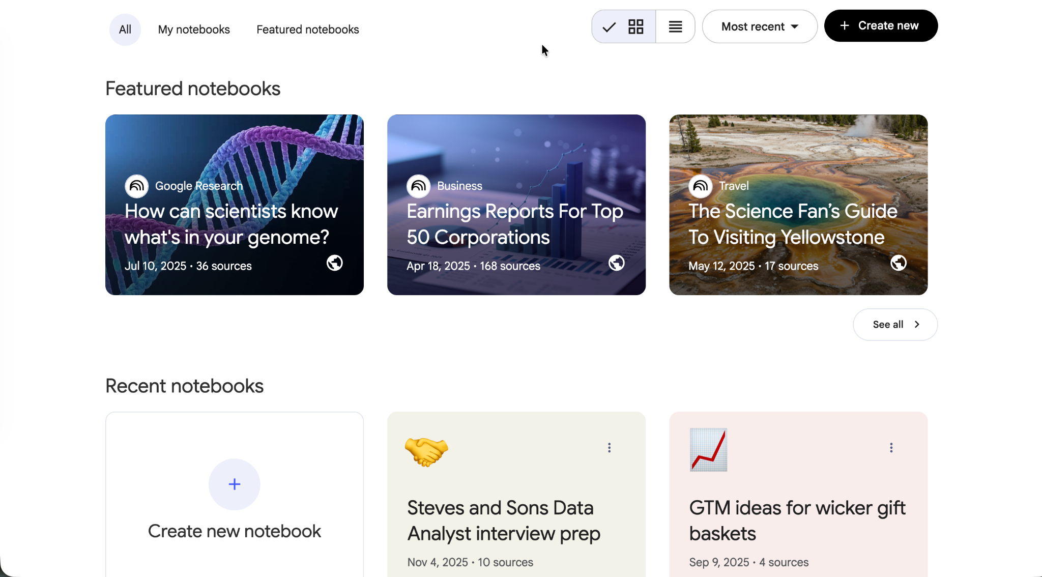
Click ‘Create new’ to launch a new session.
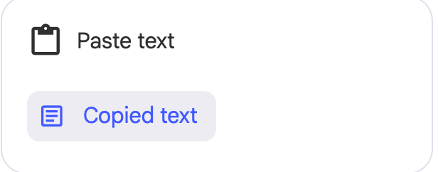
There are many ways to add sources to your NotebookLM session. You can:
- Link to a Google Drive
- Add a website link
- Paste a YouTube URL, or
- Paste text directly (great for campaign data or copied notes)
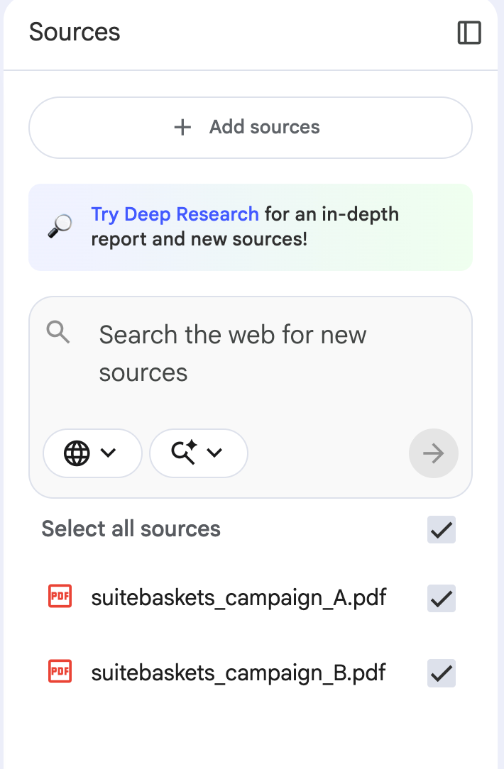
We have two .csv (Excel) files. So, we are going to upload them. You can copy/paste text directly by selecting the copied text in the NotebookLM sources.
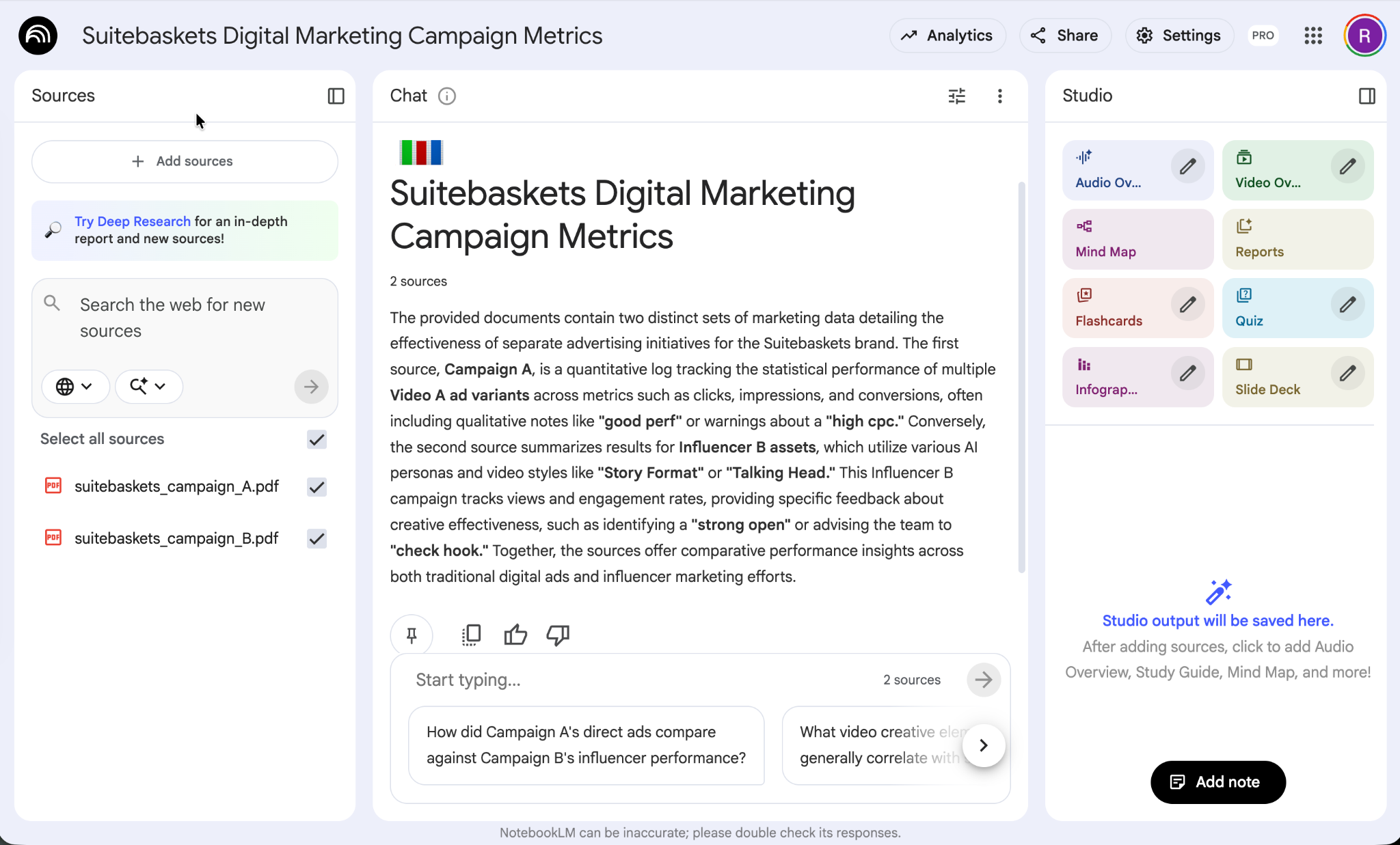
Upload your sources and get ready to clean your data and extract visually appealing insights.
Step 2 - Analyze and create infographics and slide decks
Now that your sources are uploaded. You can upload more sources by clicking ‘add sources’ in the column on the left.
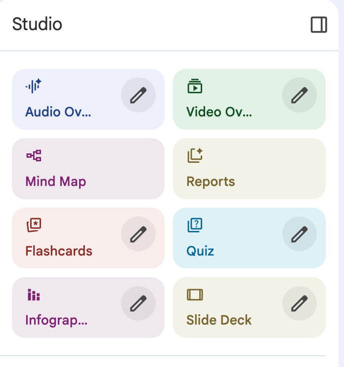
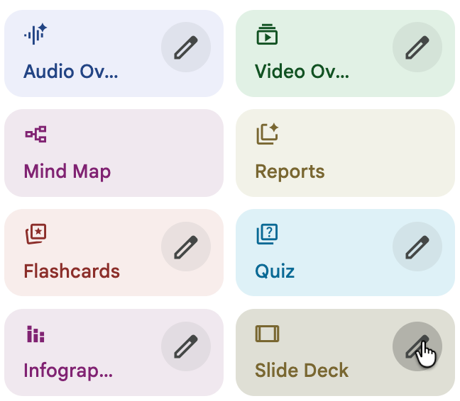
Go to the column on the right. Here you can select a variety of creation options such as video, audio, quiz, etc.
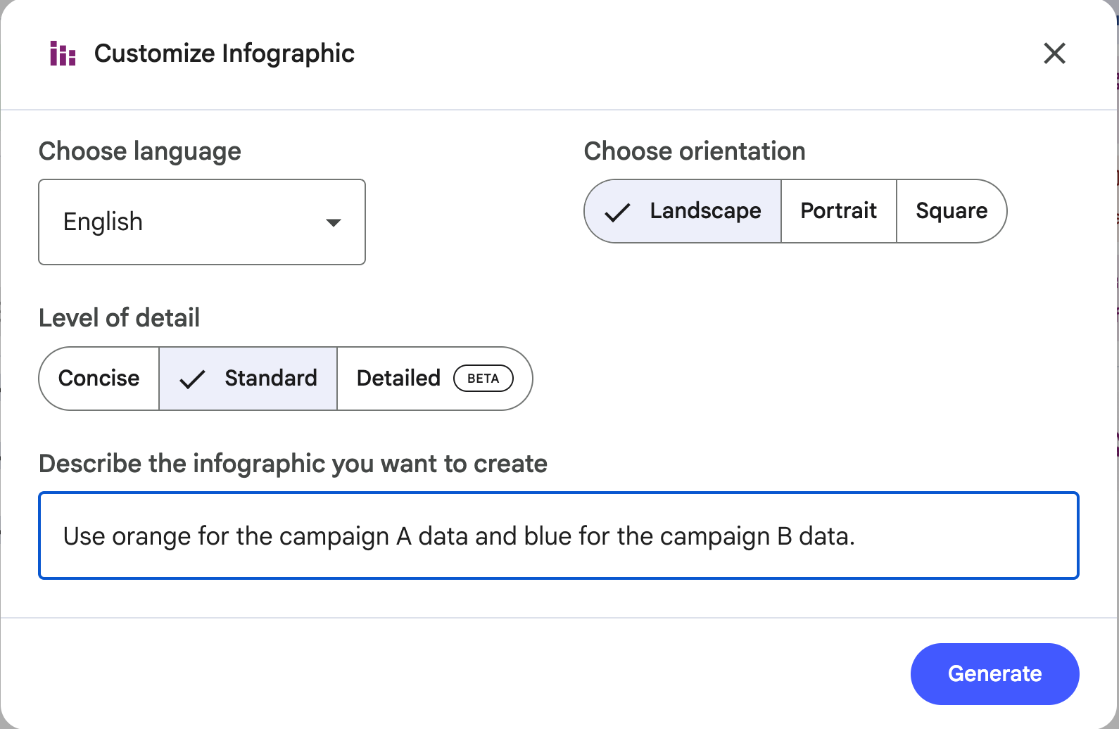
To create an infographic, select the edit icon in the infographic card. Choose a landscape in the orientation section; Standard for the level of detail, and tweak color theme or tone to match your brand identity. Click ‘Generate.’
Prompt:
Use orange for the campaign A data and blue for the campaign B data. Find the winner and show it clearly in the infographic.
NotebookLM might take a few minutes to create a visually striking infographic based on your data.
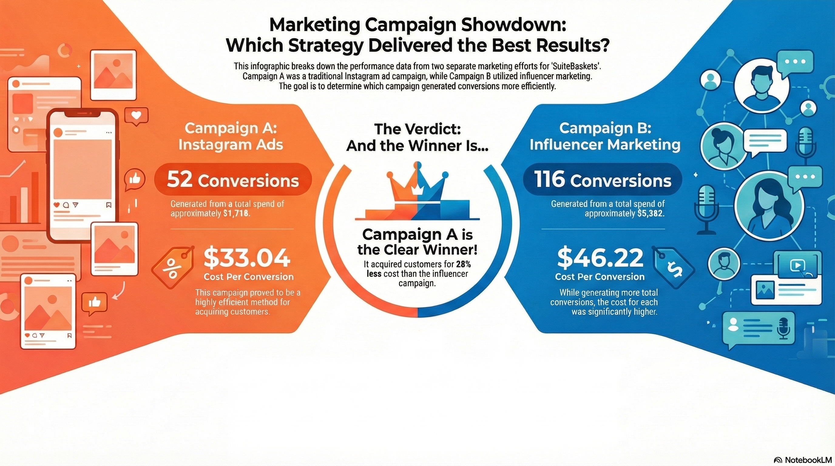
It’s not bad at all. You can provide detailed prompt to create the infographic you want.
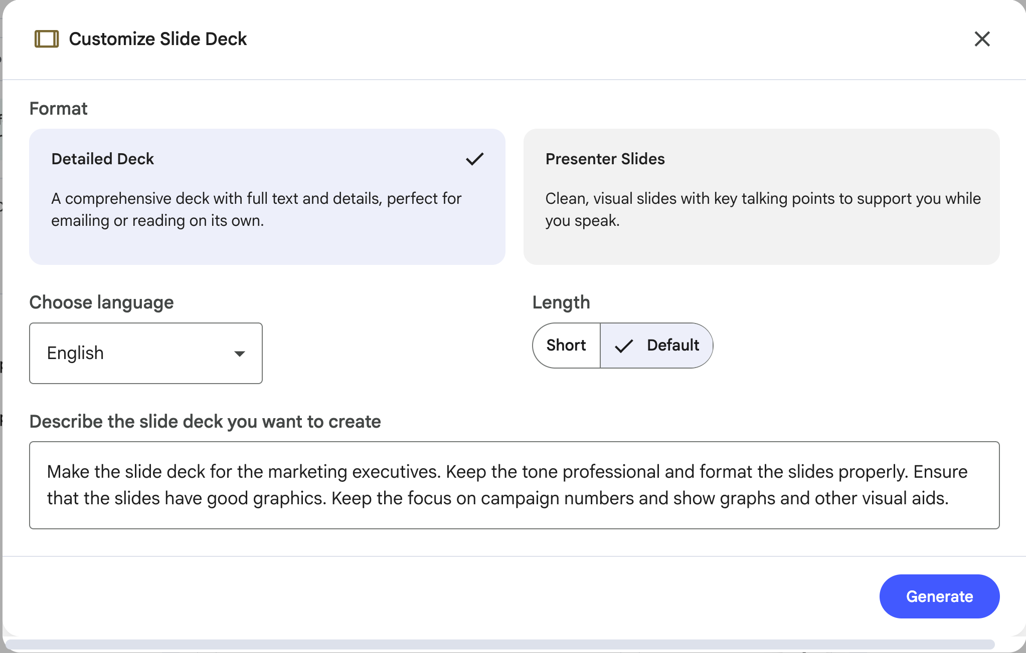
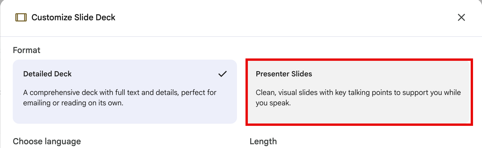
Let’s say you want to create a slide deck. Upload new sources or add more to the already uploaded ones. Click the edit icon in the slide deck card.
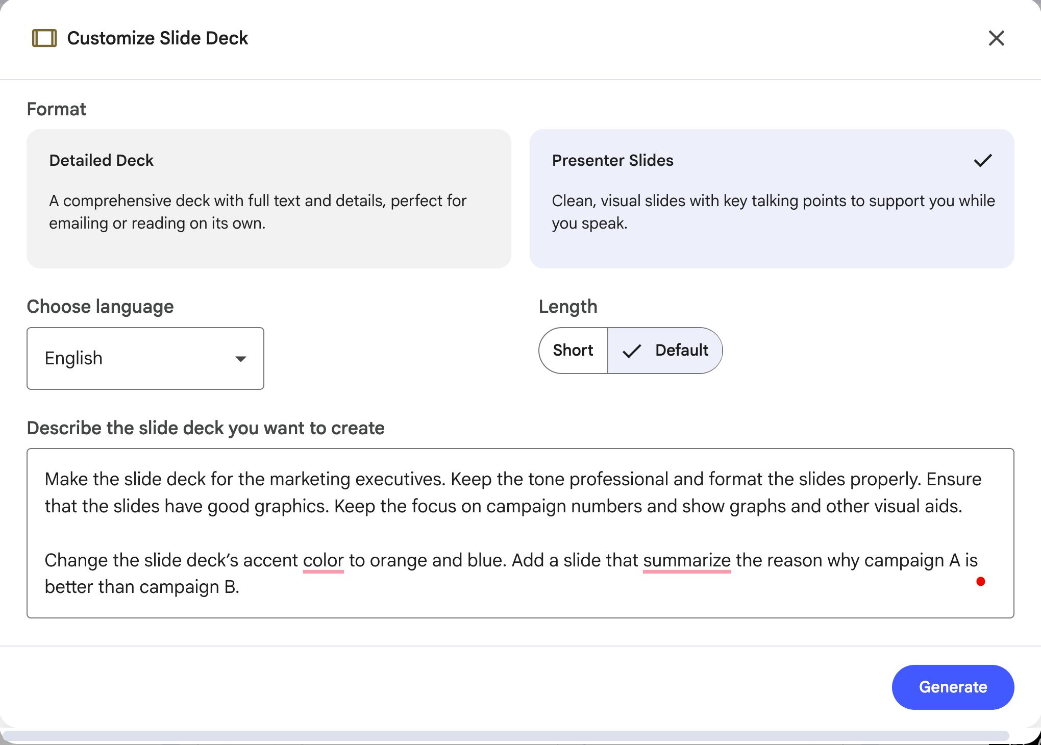
Choose the length of the deck. It can be long for a deep-dive analysis or a short version for a quick glance. Next, set language and add custom instructions. Bascially, you can specify how you want the slide deck to look. You can specify the tone, audience, style and focus. Hit ‘Generate.’
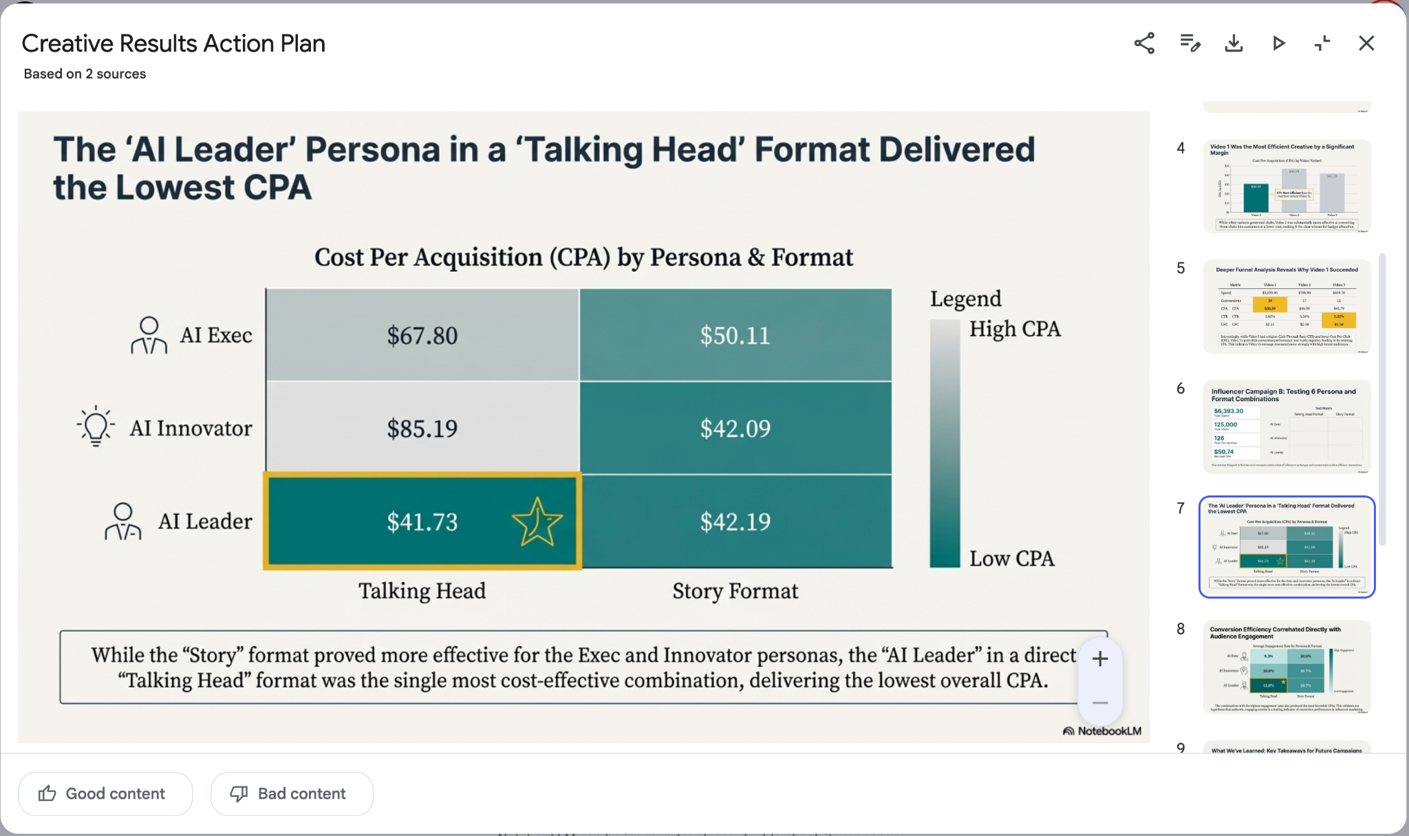
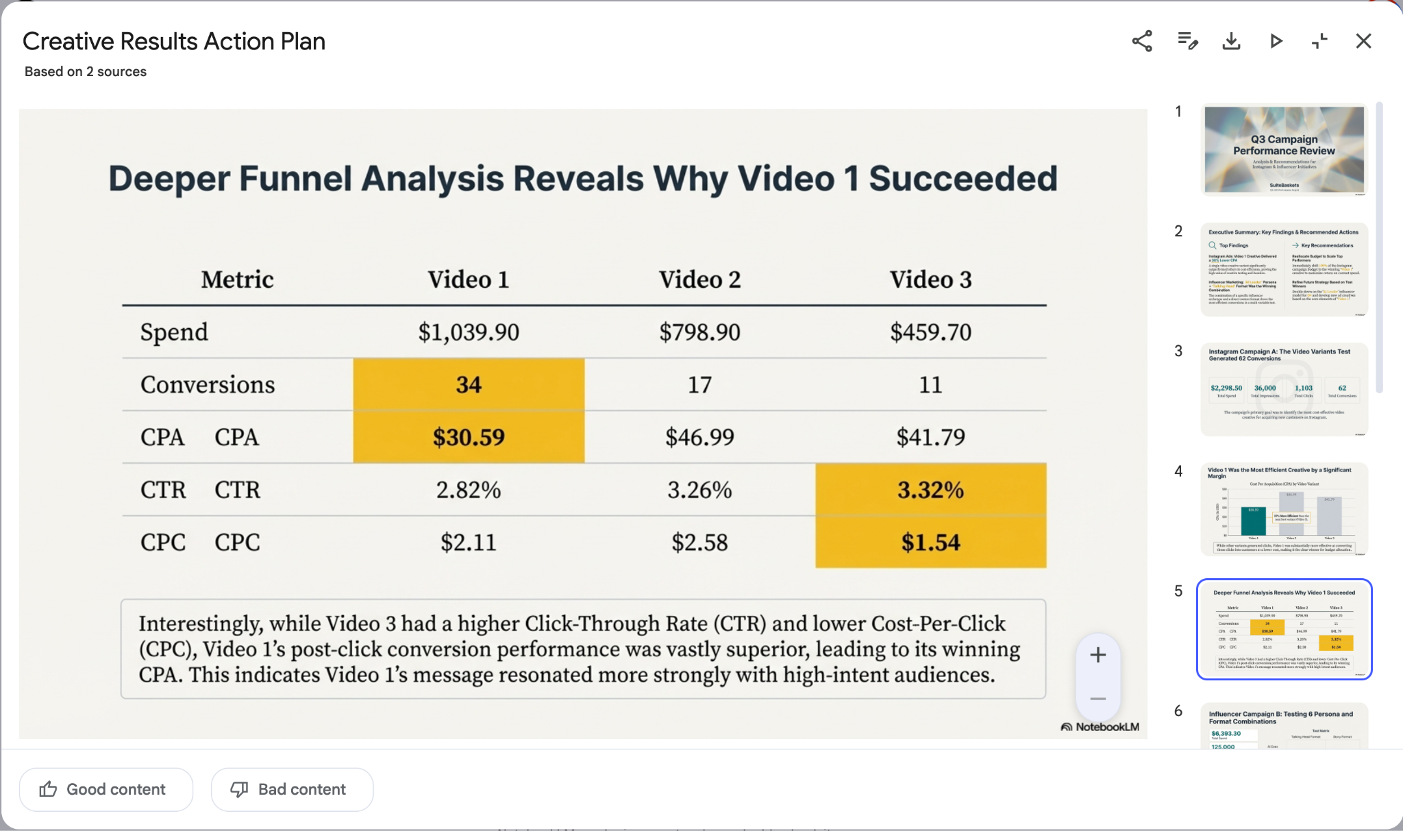
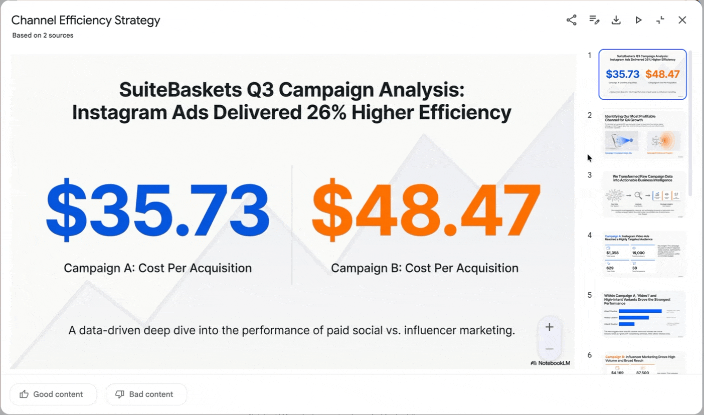
The slide deck came out really good. You can see that NotebookLM took care of the design and focus. It looks fantastic.
Step 3 - Review and make changes to the output
NotebookLM whipped up a slide deck that lays everything out. You get a clear recommendations
- like go with Variant B for more customers, lower CAC and better ROI
- Charts and bars break down how each option performs across the funnel
- The customer journey is laid out side by side for Variant A and Variant B
- An appendix lists all the campaign counts and performance numbers
It is the kind of deck executives look at and instantly understand.
Review the output and check whether the deck is up to your standards. You can ask NotebookLM to modify the deck according to your brand identity. Let’s say you want to add a slide that shows why Campaign A is better than Campign B.
Prompt:
Change the slide deck’s accent color to orange and blue. Add a slide that summarize the reason why campaign A is better than campaign B.
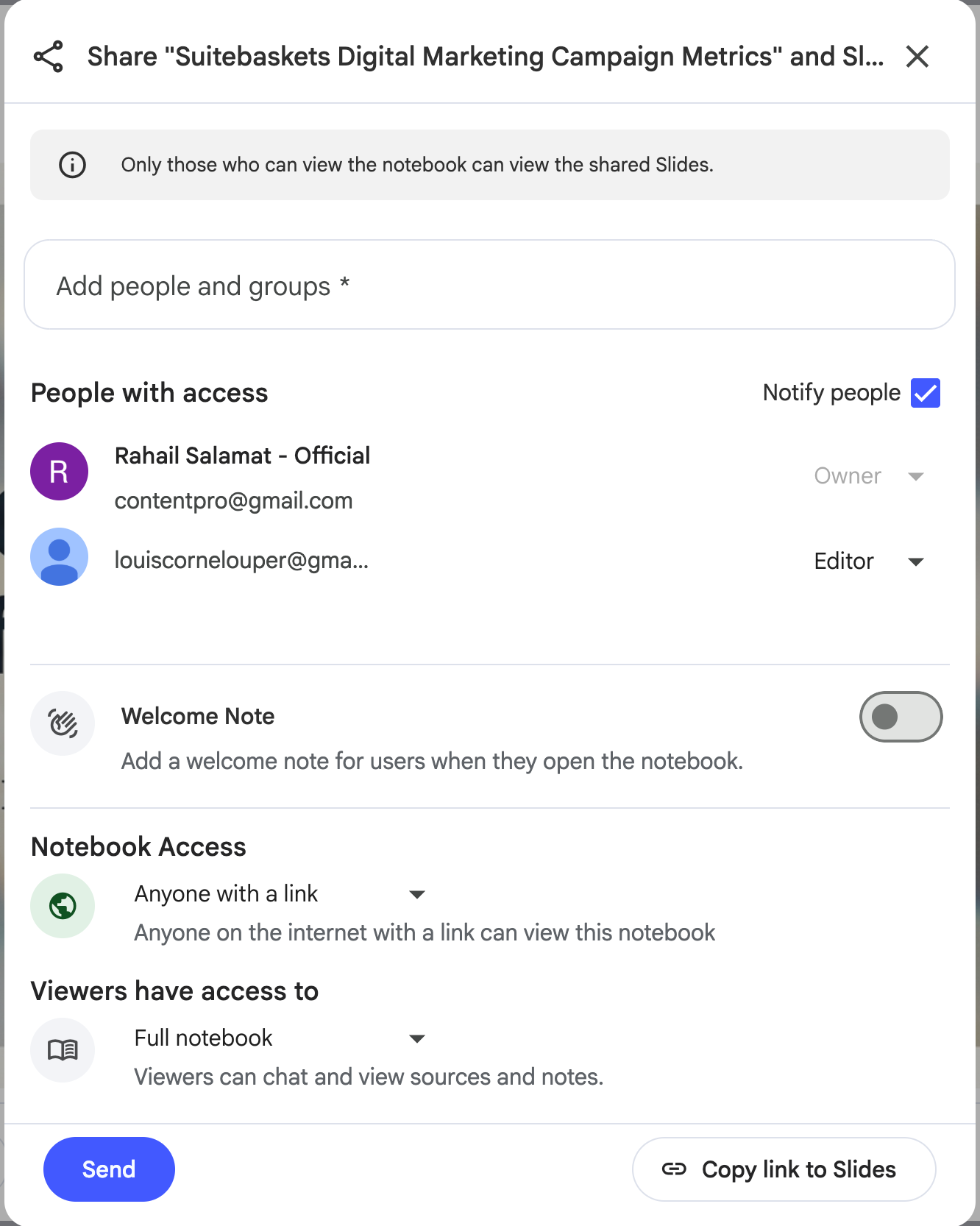
Step 4 - Share your work with stakeholders
Once you’re satisfied with the results, download it and share it with your team or anyone who needs it.
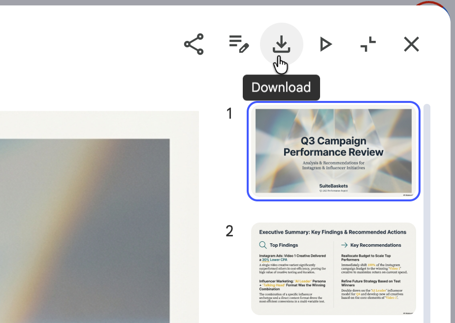
Click the share icon and share it with others by specifying the emails of your team.
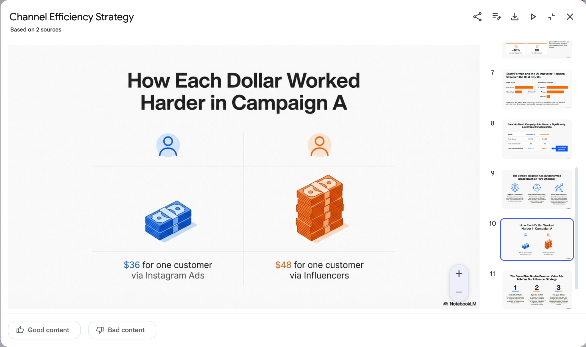
It looks amazing. The slide is rich in images and graphs.
You can also flip on presentation mode and walk through the deck right away.
That’s it for this tutorial, marketing wizards! You can reuse this workflow to learn tough topics, analyze complex trends, a tweet thread, a book excerpt, an academic paper or even a YouTube transcript. NotebookLM can turn it into an infographic that explains the idea visually and a slide deck you can use to teach it. Teaching is one of the simplest ways to memorize, and these slides make it feel effortless.

.png)

.png)